Dashboard: MLflow
About Our Use of MLflow
This is a tour of the RapidFire AI app’s in-built dashboard to visualize all ML-related metrics. It is an extension of the MLflow dashboard, and it inherits most of MLflow’s native functionalities.
As of this writing, we only support MLflow for metadata management and ML metrics visualization. But RapidFire AI is not tied to MLflow, and it can easily work with other tools such Weights and Biases. Of course, reformatting all experiment metadata to work with other such tools is already possible. We plan to expand more support for other such tools based on feedback.
Tabs in the Dashboard
The first screenshot below shows the main “Experiments” tab where you will see all ML metrics of all your experiments on the given cluster. Under this tab, you can see 4 main sub-tabs:
Table
Chart
Experiment Log
Interactive Control (IC) Log
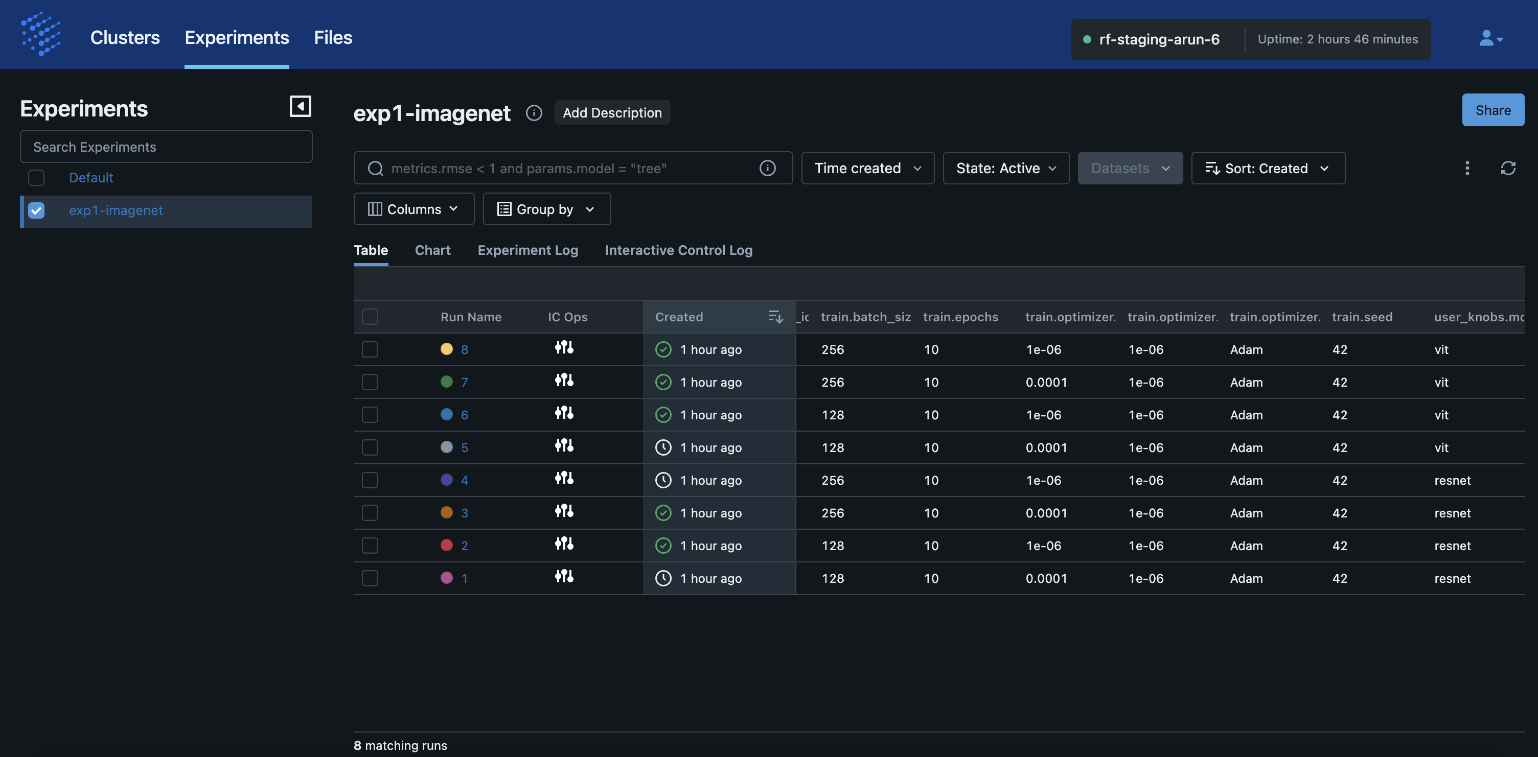
The screenshot below shows the “Table” view of an experiment with all its runs. Each run represents one model with one set of config knob values, which is standard MLflow semantics.
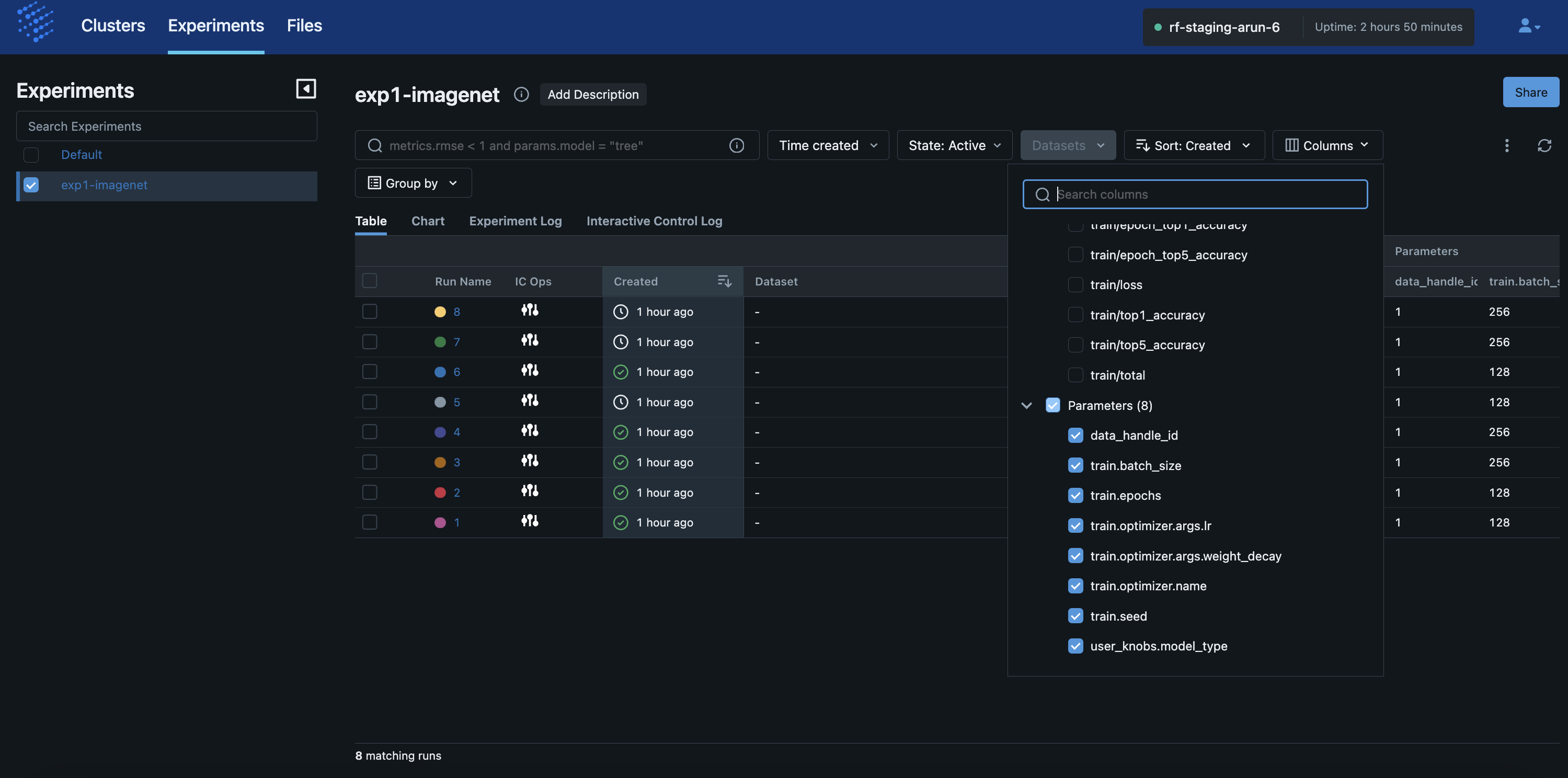
The screenshot below shows how you can adjust the columns displayed for the runs in the “Table” view. This is standard MLflow functionality but the columns are populated with both “Attributes” native to MLflow and “Parameters” whose values are injected by RapidFire AI based on the config knobs you gave in your notebook for that experiment.
Metrics Plots
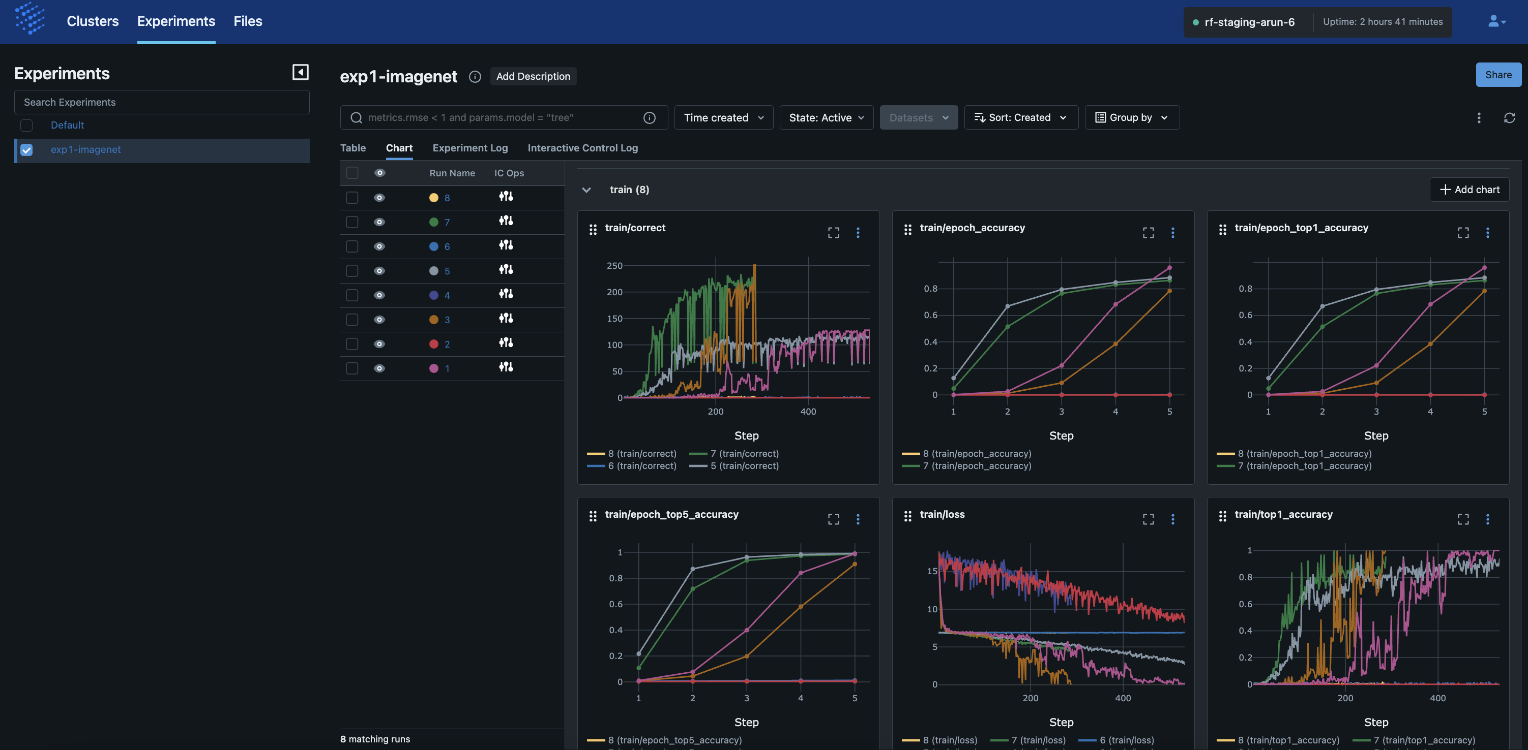
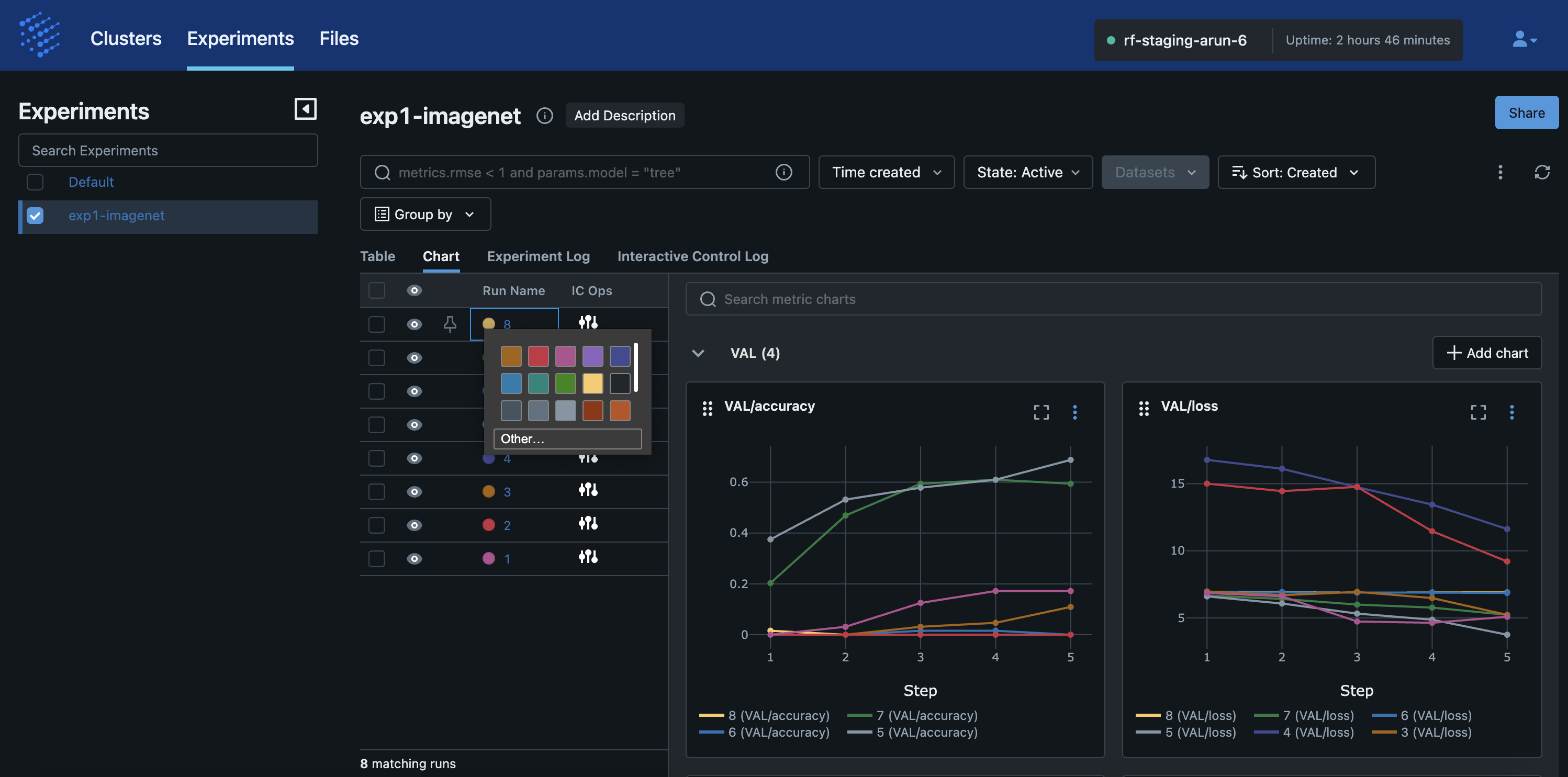
The screenshot below shows the “Chart” view of an experiment with all its runs.
Each plot corresponds to a metric you gave in your notebook, spanning named_metrics in your
config knob (for train and val sets separately), as well as any key-value pairs you returned in your
compute_metrics() and aggregate_metrics() in your MLSpec.
We call attention to 3 key aspects of the visualizations here:
The x-axis “Step” for the mini batch-level plots represents absolute number of minibatches seen by that run. So, if the
batch_sizeis different for different runs in your experiment, they will take different numbers of steps and the curves won’t line up till the end. This is not a mistake but the expected correct behavior.The x-axis “Step” for the epoch-level plots represents absolute number of epochs seen by that run. So, if the
epochsis different for different runs in your experiment, they will take different numbers of steps again as above.The plots update automatically as the RapidFire AI workers continue the training and validation. But we still recommend that you refresh the browser page to ensure the MLflow mechanism pulls the latest data from the cluster when you want to look at the plots.
The screenshot below shows how you can adjust the colors of the runs’ curves in the plots. This is standard MLflow functionality.
Message Logs
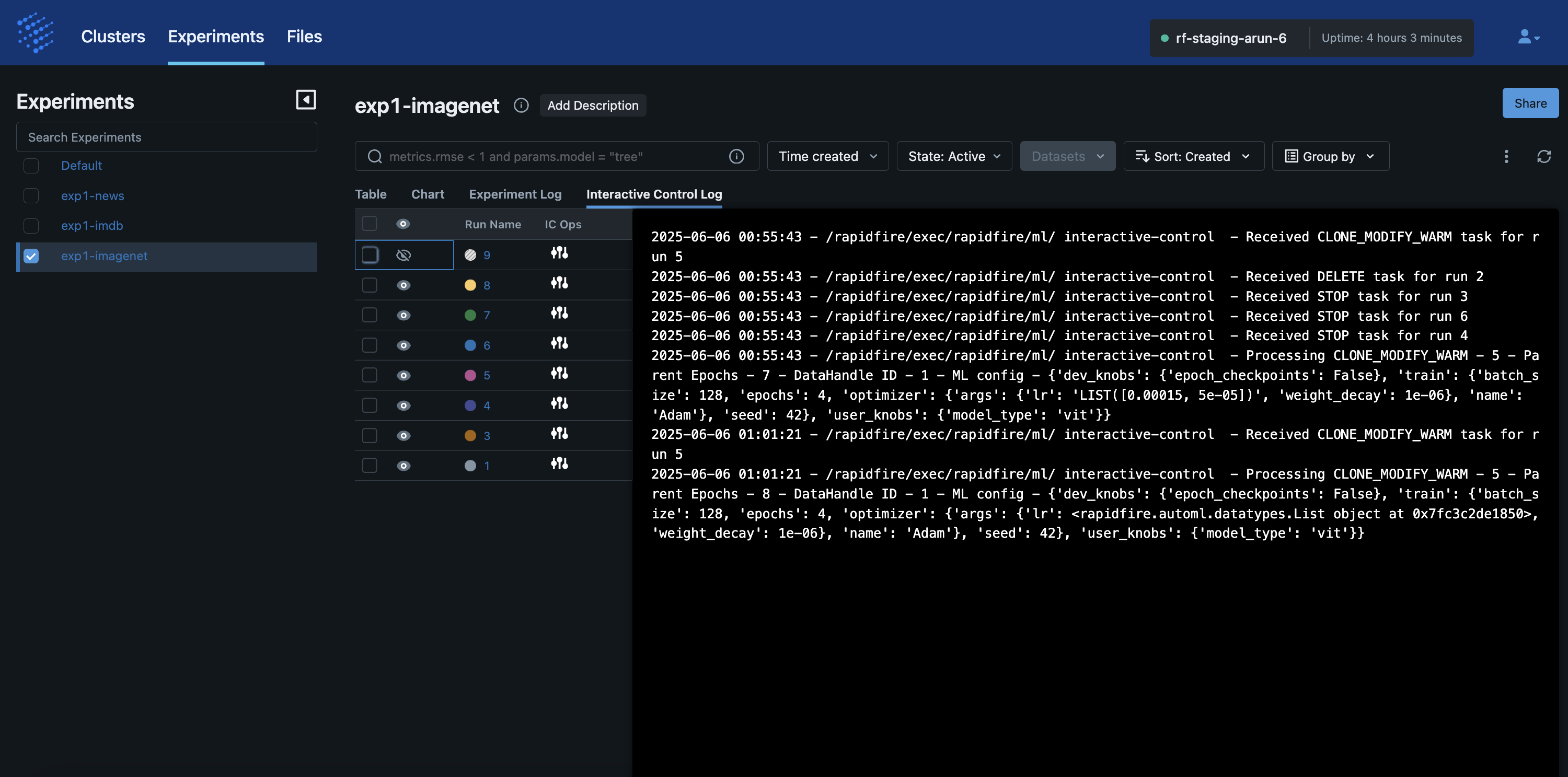
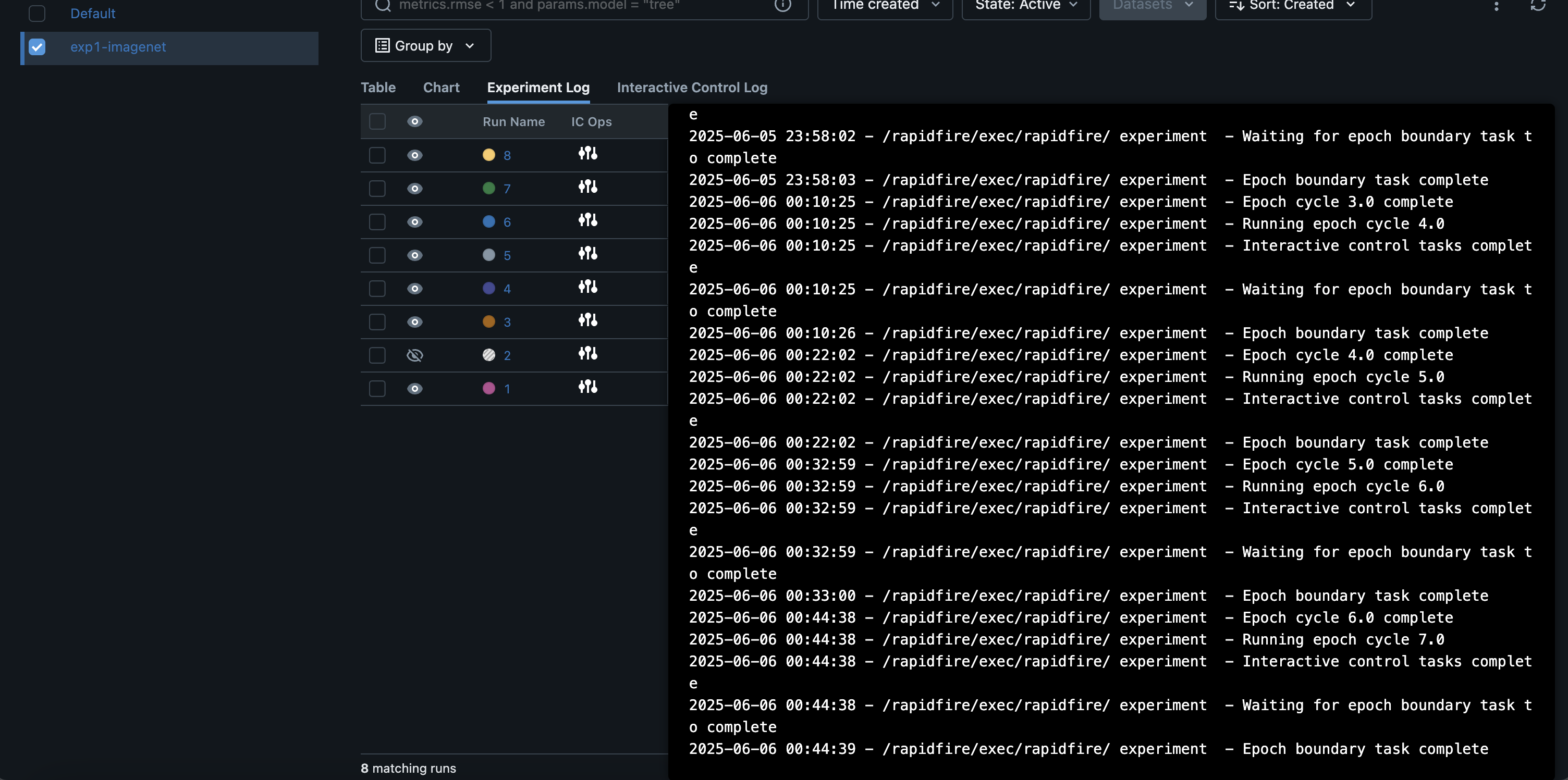
The screenshot below shows a continually appending message log named the “Experiment Log” from the cluster. It reflects all the key operations you have done in the session so far on the notebook, both for the current experiment and any prior experiments in the same session on the cluster.
The screenshot below shows a continually appending message log named “Interactive Control Log”. It reflects all the Interactive Control (IC) operations you have done in the session so far on the IC ops panel, both for the current experiment and any prior experiments in the same session on the cluster.
